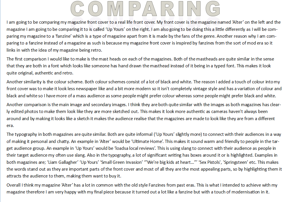
The first part of this post is a picture of my magazine next to a picture of a magazine which I have compared my magazine against. underneath is the comparison in which I carried out to try and understand the good parts and bad parts of my magazine. This helped me reflect on my work to see how I made it personal and my own yet still made it professional and similar to other magazines, or fanzines in my case. 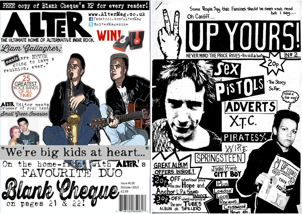
This is my final version of my front cover. As you can see, it has a sort of old style fanzine look about it. I did this so that it makes my magazine look retro and old style. I did the same with the fonts, as I used a typewriter font. This was to make my magazine look old, retro style also. All of the images are my own images making the magazine more personal and professional. I included social networking sites and a website so that my magazine can expand on the target audience and connect with the readers in more than just a print version of a magazine. I included; giveaways, pugs, competitions, pull quotes, flashes, masthead, tagline, cover image etc. so that my magazine looks professional and pulls in the target audience as it includes all of the codes and conventions of a music magazine. 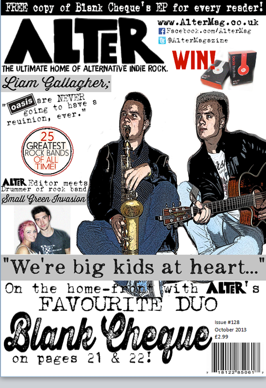 This is the flat pla of my front cover which i produced. This is how i want my cover to be set out in terms of which parts of the front cover are going where. This will help me and give me a guideline when coming to creating and making my own front cover. 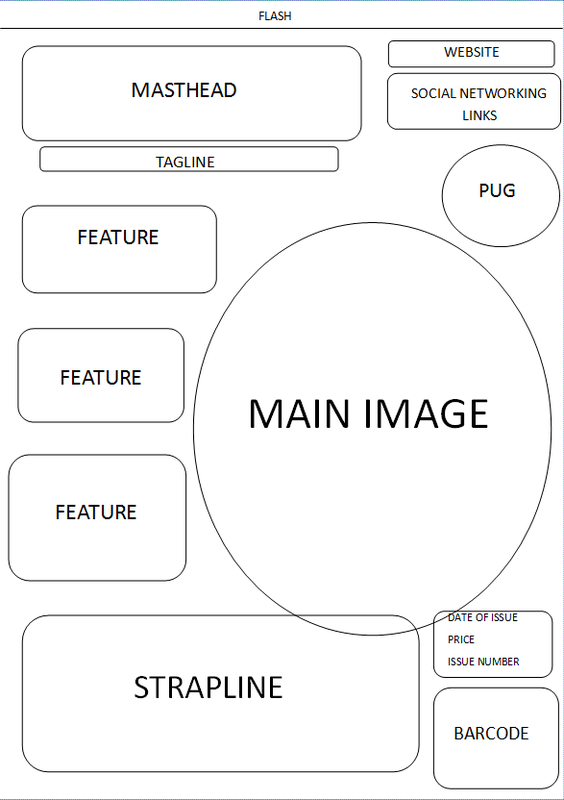 This is the homework I did on annotating language on a double page spread of a music magazine. We did this so that it helps us with our language skills when it comes to designing and making our own double page music magazine spread.  This is the feedback sheet which everyone in our class carried out by asking a member of the class to give feedback on their front cover up to now. We get a mark out of 50 broken down into marks out of 10 for the different elements of our magazine. For 'images', I received a mark of 9/10. The comment I got was, 'all colours match images and fit with text well'. For 'masthead and typography' I got a mark of 9/10 also, and the comment was 'bold and creative - bit at the bottom doesn't match.' for 'colour scheme and subgenre' I got a mark of 8/10, the comment said 'colours are all matching - could add some variation.' for 'layout' I got 7/10, and the comment said 'main image only takes up a small bit of the page - little crowded'. for 'use of pugs, flashes and banners' I got 9/10, the comment said 'not too many and all fit with style. overall I got 42/50 for my front cover. The positive feedback I received was 'I like the masthead and how you included twitter and Facebook'. The constructive criticism I received was 'the main image is a bit small and there is a bit too much writing'. 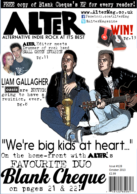
These are the templates of how my masthead and cover image may be portrayed in my final piece. I chose different types of edits of the photo to try and make it fit with my genre to give it brand identity. I chose these four designs because I like the idea of my magazine looking like an old style fanzine. I think making my magazine like a fanzine style would be a good idea because it is original which links with the indie genre and it is also from a past era which makes my magazine have even more of a retro feel. My final decision was Example 4 because of the reasons which I stated underneath. 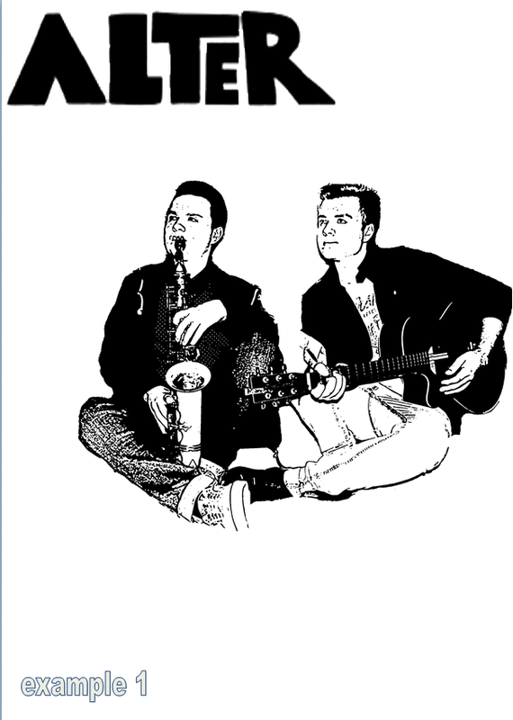 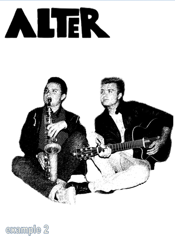 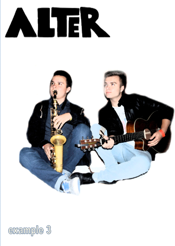 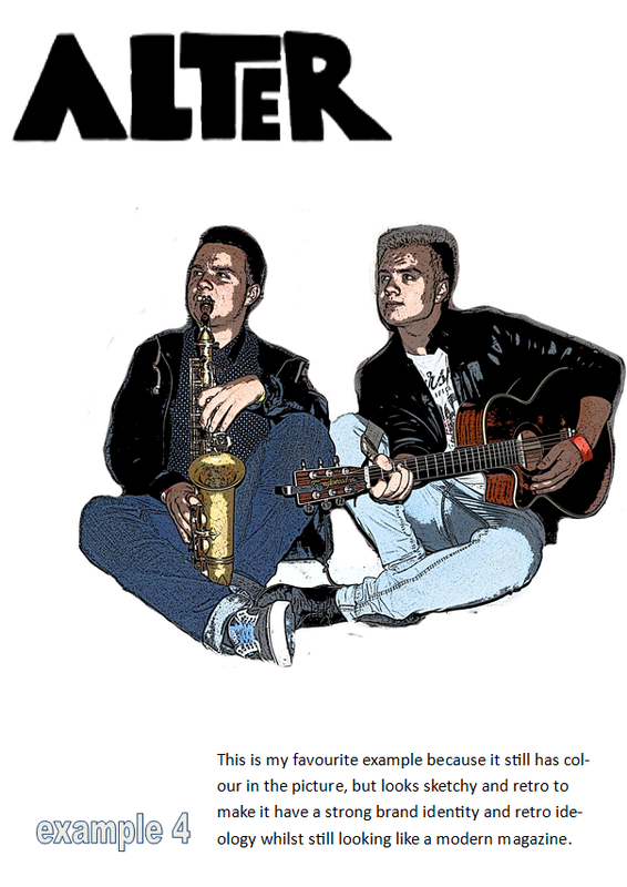 | AuthorAimee Wood - Aquinas Media Student - AS year. ArchivesJanuary 2014 Categories |
 RSS Feed